Written by Fernando Maciá
Index
User experience, according to Donald Norman, encompasses all aspects related to the end user’s interaction with the company, its services and its products. Don Norman is credited with popularizing this term while working at Apple in 1993 as a User Experience Architect (this was the first time the concept was used to describe a job title). He himself claims that he invented the concept of user experience because the existing concepts such as “human interface” and “usability” were not enough to describe the user experience. all the experiences a person can have with a system. However, there are some older publications that already reflected some concern for user experience on the part of usability engineers.
Currently, it is known as “user experience design” to the discipline that is responsible for analyze users to discover their needs and design products or services that respond to them. Dedicated professionals are UX designers, although there are many specializations that lead to more specific positions such as UX researcher, UX writer, etc. However, it is worth remembering that the experience cannot be designed, since it is subjective and therefore different for each user. The work of designers will thus focus on creating products following certain best practices and conducting extensive research to try to make that experience as satisfactory as possible, taking into account not only the user but also the constraints or particular requirements of the user. business (sector, strategy, economic viability, etc.) and of the technology (type of digital environment, technical constraints, etc).
Although user experience as a concept can also include moments of contact with the product outside the digital world, in this article we will focus on the interactions that occur between a user and a digital interface, such as a website or an application. In the following, we will detail some aspects that can influence the user experience in the online world.
What the UX depends on
The factors related to user experience are varied and have to do with the extent to which our site satisfies the user throughout their browsing and even before they start browsing, as we will see below.
Rich snippets
When someone finds us through a search engine, the first contact they have with our website is the one that appears in the search results: title, URL, meta description. Using this option to adequately present the user with the information of the page they are going to visit is crucial, because if it does not correspond to the target page, the experience will be negative and will result in a lower click-through rate on the result itself, or in abandonment.
Information architecture
A correct deployment of the information architecture of the site through the relationship of its different content cores will facilitate the achievement of the objective of those who visit our website. Giving a coherent hierarchy to the different sections, from the most generic to the most specific, will promote intuitive navigation.
Headings and content
It is important to present the user with the information they are expecting to find. Therefore, the headings h1, h2, h3, etc., as well as the texts, images and other resources used must be in agreement and form a whole around a specific concept. Not only that, but we will also have to take into account the clarity and readability with which these contents are presented: any slightest hint of difficulty in reading an article or news item will be a reason for abandonment.
Adaptable design
It is obvious that a user will not have a pleasant experience if, when visiting a website from his cell phone, he finds navigation impossible.. This is where the mUX or “mobile user experience” concept comes into play , which deals specifically with the consumer experience in mobile environments. For example, the fact that a button is not large enough to be clicked with a finger instead of a cursor may cause the user to become frustrated and decide to leave our website just when they were ready to buy.
Discharge time
We are becoming increasingly impatient: we are getting used to very fast download times, so neglecting WPO (Web Performance Optimization) of your website will cause your users to abandon it as soon as it takes a few seconds too long to load. Respect your visitors’ time and optimize your website to present the content they are looking for as quickly as possible. If you want to learn how to do it, we recommend you to take a look at our articles about WPO.
A well-designed navigation will make it easy for your users to move around your website, knowing at all times where they are, where they are coming from and where they are going. Remember that your visitors enter your site with a goal in mind (buy a product, read an article, hire a service, etc.) and you must make it easy for them to get there with the minimum cognitive effort on their part. For example, having a well-optimized internal search engine or filters on pages with many products will allow them to find what they are interested in more quickly. Likewise, the user must be able to anticipate where a link will take him or her before clicking, so clarity in the wording of button texts and other hyperlinks is essential. Why write “Go ahead!” if we can inform the action to be taken with a simple “Buy now”?
Visual design
In addition to having an adaptable design, our website should ideally have a coherent and consistent visual identity. This will help to situate the user in the different levels of our architecture, but will also help to detect changes, for example, to make sure that the user’s action of clicking on a button has indeed transported him to another page.
Safety and confidence
In general, being able to convey trust and credibility to our visitors is very important in any Website. However, in certain sectors such as e-commerce, where the user will have to fill in sensitive information such as their credit card number, getting the user to trust us will be decisive in getting them to convert. Implementing HTTPS on our site, optimizing our payment gateway and/or presenting customer testimonials, among other improvements, will help us gain the trust of our visitors.
UX as a positioning factor
Given the growing authority that UX is gaining within the SEO discipline, the User Experience concept should be studied as a subset of essential concepts within the SEO universe. Nowadays, it is not possible to apply SEO without taking into account the guidelines set by UX-focused optimization. If you want to know more about this topic, take a look at the article The importance of user experience in SEO by our consultant María Navarro.
Proof of this is the Page Experience Report or Google Page Experience Report, in which the search engine “provides a summary of the user experience that visitors to your site have had” based on a series of metrics that “will be used as a positioning factor of a URL in the search results”.
Google takes into account different criteria for this calculation:
- The famous Core Web Vitals, related to the loading speed and stability of a page experience. In this post we tell you how to improve them.
- Mobile usability: your Website must be navigable from a mobile device without errors.
- Security issues.
- Use of HTTPS: the use of the HTTPS protocol is becoming essential (even more so). If many of your URLs use HTTP, your report will show the message “Failed”.
- Ad experience: make sure that the ads inserted on your website do not hinder or interrupt your visitors on their way to achieving their goals, resulting in a poor user experience.
On the other hand, there are other analytical indicators that can bring us closer to the knowledge of the personal experience of a user within our website, such as, for example:
- Bounce rate: represents the level of abandonment that users accumulate during their visits. A bounce occurs when a landing page is closed without having clicked on a link to navigate to another section of the site. This data is shown as a percentage and is useful to understand how the user values a page accessed, for example, through the search results, understanding that he/she values it positively if he/she decides to browse the web for further information. This factor will not be useful in a conversion landing page, whose objective is for the user to reach the goal (for example, to make a phone call) and then close the page.
- Duration of the visit: the time spent by users on a page is crucial to understand the interest shown in it. This data will sometimes be linked to the bounce rate, since if a user has stayed for a long time on a single page for information, even if he/she has abandoned it, it may mean that the user has been attracted by the content and, if he/she has not made a conversion, he/she could come back and do it later.
- Number of pages visited: indicates how many different sections the user has visited before leaving the site. To draw the right conclusions from this concept, it is necessary to relate it to the previous one, since, for example, a 2-minute visit to two pages may a priori represent a better quality of visit than a visit of the same duration to 12 pages, to which very little time has been devoted.
Related terms
 UI
UI
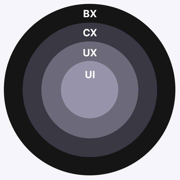
The user interface or UI refers to what the user interacts with directly to achieve a given objective, such as a website or app. UI design is the discipline in charge of optimizing the visual aspect of this interface: colors, typographies, interactions, animations, icons, images, buttons, forms, etc. Good UI design will contribute to improving the user experience, but it is only one of the layers or phases of the entire UX process.
Usually carried out towards the end of the project after the research and wireframing phase, the UI designers will gather all the information obtained in the previous stages to design a usable, clear and consistent interface. To do so, they use prototyping tools such as Figma, Sketch or Adobe XD, with which they can achieve high-fidelity prototypes capable of simulating almost all the interactions that a user could have with a real website.
Customer experience (CX)
Customer Experience describes the outcome of a customer’s interaction with a brand across all its touchpoints. This would include all channels, both physical and digital: visiting your website, shopping in a physical store, making a phone call, contacting customer service, etc. Therefore, the user experience would be only one part of the whole customer experience. It is measured by metrics such as customer satisfaction, likelihood of using our product again, likelihood of recommendation, etc.
Brand experience (BX)
Brand experience encompasses the totality of sensations, feelings, thoughts and actions evoked by a brand, both for its potential customers and for other stakeholders such as its own employees. In this way, it would include the experience before, during and after getting to know the brand, being especially relevant the messages conveyed through brand identity, packaging, advertising, etc. Thus, the Brand Experience is the broadest concept, containing the Customer Experience, which in turn contains the User Experience.
Usability
According to Jakob Nielsen, “Usability is the extent to which a product can be used by specific users to achieve specific objectives with effectiveness, efficiency and satisfaction in a specified context of use”. Some people use this concept as a synonym for user experience, but, in reality, usability would only be a part of UX: having a good usability would be the unavoidable basis for a satisfactory user experience, which will be achieved in conjunction with other factors.
When analyzing usability, UX designers will subject the website to heuristic analysis to check that it meets certain requirements such as visibility of system state, consistency and standards, error prevention, etc. Although these heuristics can be very varied, the best known are Jakob Nielsen’s 10 general principles for interaction design.
End users can also be involved in this usability analysis through surveys, interviews and user tests.
Finally, designers can use EyeTracking tools to discover how users look at a website, which parts they look at, how they move around the screen, etc. Also common are tools that present heat maps where we can see the areas with which our visitors interact the most, such as Hotjar.
Accessibility
Web accessibility seeks to make web pages accessible and usable by the maximum number of people, regardless of their knowledge, personal abilities or the technical characteristics of the access device used.
Therefore, ensuring that our website complies with the Web Content Accessibility Guidelines (WCAG) will enable us to provide a satisfactory user experience to as many people as possible. Depending on the extent to which our website adheres to the various WCAG guidelines, we will be assigned a different level of compliance: A (minimum required), AA (intermediate) or AAA (advanced).
References
The definition of User Experience (Nielsen Norman Group)
Why you should ditch your UX definition, and use this one instead
Crash Course: UI design, by Jeff Wang
Why understanding Customer Experience makes you a great UX Designer


