Written by Fernando Maciá
Índice
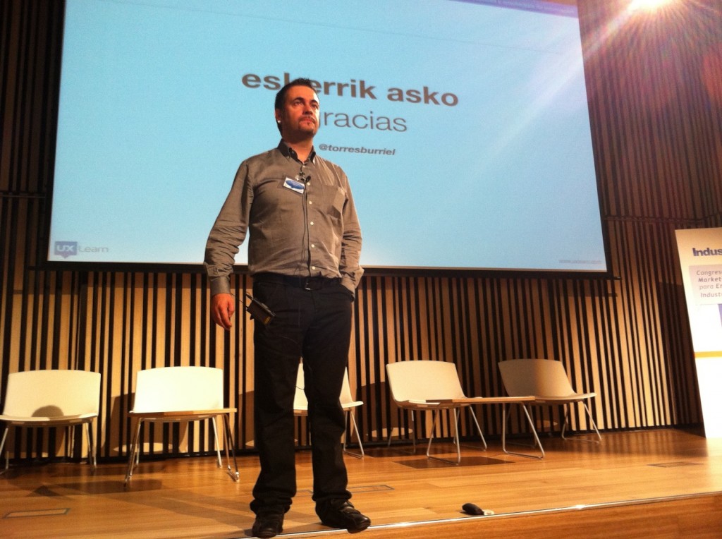
Daniel Torres Burriel at the Digital Marketing for Industrial Companies Congress
Summary of the intervention of usability expert Daniel Torres Burriel (@torresburriel) at the Digital Marketing Congress for Industrial Companies How to approach a Web project taking care of the future user experience.
Usability and user experience are not the same thing. User experience is: implicity, meeting objectives and it is not technology. First of all, when considering our presence on the Web, we must be fundamentally concerned with simplicity.
We tend to want to show everything, to include too many things. We fill the screens with noise and this confuses users. So simplicity is our ally.
User experience is about meeting objectives: it is essential to work to achieve certain objectives. A poor description of the objectives causes the user experience to decline. Day to day life eats us up and we end up moving away from our objectives if they are not perfectly defined.
It shows as an example the Clear chair model, by Canedo Studio, formed by two methacrylate or polycarbonate plates that within its simplicity fulfills its function perfectly.
Objectives
What I am going to do and what for. In ’96, being on the Internet was enough. Nowadays, it is also necessary to have a return on the investment of the Internet presence. To do so, we must have clear objectives. The SMART concept:
- Specific
- Measurable
- Achievable
- Realists
- Limited in time
Specific: if we do not have elements to measure how we achieve the objectives, then we have a problem. What is the objective? In what time frame are we going to achieve it? So we need to have clear objectives about what, where, when and how the situation is going to change.
Measurable: that it is possible to quantify the goals and benefits I hope to achieve. The Web project doesn’t end when it’s finished, that’s when it really begins. It is when it is put into production that we must have references and measure to make improvement decisions in order to meet the objectives. If people buy, it means that the site is usable. People enter Web sites to satisfy a need. Normally, everything on Web sites is tested with users in order to improve the prototypes and models so that they can then have the best performance. Observe what they do and learn why they do what they do, to stay ahead of our audience and avoid mistakes.
There are generic usability recommendations: buttons should be easily identifiable, links should be seen as such, texts should be legible…
Good usability practices with three elements to take special care of: buttons, links and forms. They are the main elements of interaction with the user. The forms are the “microphones” that we put on the user. Buttons are the elements that allow the user to perform actions and links are the elements that the user uses to navigate.
When designing forms, we must request only the strictly necessary data. Sometimes we are obsessed with collecting as much data as possible, and this goes against what users may be willing to give. If we ask for data, let us explain why.
Achievable.
Realistic: possible, achievable with the available resources and within the given timeframe.
Time-limited: establishing the period of time in which each of them must be completed.
User experience is NOT technology
Technology is just a tool. If we put the focus on technology we end up doing things we don’t want to do.
Technology:
- It is a tool
- It is not an end
- It should not be an end in itself
- Please do not let it be an end.
There comes a time when you have to make a choice between experience or functionality. You don’t hit or miss: it depends on the company, sector, etc. What can we do? Incorporate to the work technology:
- Ethnographic analysis: ask customers, suppliers, salespeople, study what users want.
- User testing: testing in person, with focus groups, remotely, etc.
- Analytics as a tool to help and support decision making.
Dashboard culture: technology at the service of fast decision making. It is a matter of having a control panel that must be incorporated into the entire methodology, which is what makes it possible to measure and make decisions for improvement.
We must also pamper the fundamental interaction elements of the Web:
- Buttons: make them look like clickable buttons.
- Links: identifiable as links.
- Forms: that collect the minimum data for the operation to work correctly.
