Written by Fani Sánchez
Index
A banner is a form of Internet advertising that consists of including a graphic advertising piece within a web page. Its main objective is to generate brand recognition and attract traffic to the advertiser’s website that pays for its inclusion. In principle, any website can include the publication of banners and other display advertising formats, although it is usually the sites with the most interesting content, with a strong specialization or with large volumes of traffic that attract the largest investments from advertisers.
Banner advertising has been copying traditional offline advertising models. In the case of the banner, its origin is in the billboards we see on the streets or in the advertising pieces we see in newspapers and magazines. These are eye-catching ads that try to capture the interest of a web visitor to communicate a message, generate brand recognition, induce the user to visit another website, etc.
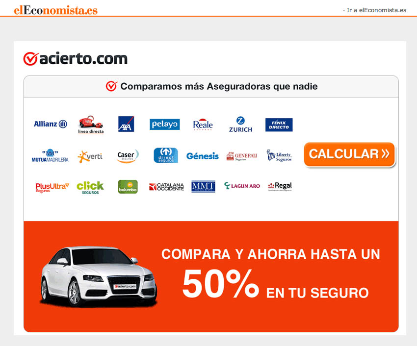
Very soon, banners began to be placed within the different content pages in such a way that they maintained a certain relationship with their context, since it is easier to connect with a user’s interest when the target to which the banner is directed and the profile of the page’s visitor are similar. Thus, it is easy to find banners about mortgages in the economy pages of an online newspaper or about lingerie in an online women’s magazine.
The banner evolved rapidly, adapting to a wide variety of formats and, by incorporating technologies such as Java, Javascript, animated GIFs, and later Shockwave, Flash, and other formats of the so-called rich media advertising agencies have managed to create high-impact ads that integrate animation, video, sound and interactivity with the user.
According to IAB Spain, banners can be classified into:
- Integrated formats: Banner formats that have a fixed position in the template of the web page where they are displayed.
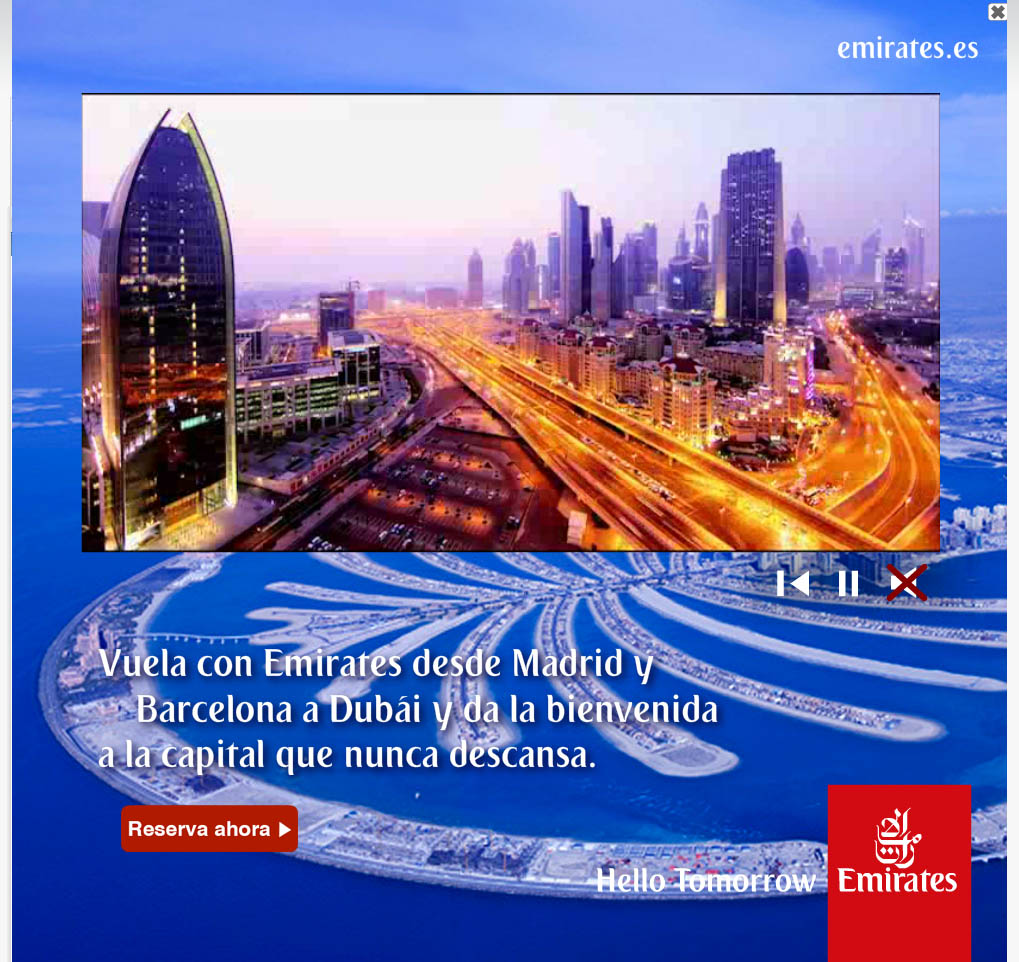
- Expandable formats: Graphic pieces that can be expanded on the screen by means of a second format called panel, whose size, expansion direction, and execution (rollover and click) will be determined by the publisher. IAB Spain recommends that all panels include a close button. Normally, these types of banners are displayed when the visitor places the mouse pointer over the banner or when the user lands on the page. Once displayed, the user can click on the close button to fold the banner again and access the content.
- Floating formats: Banner formats that have no fixed position on the web page. They usually move along the content of the web page in which they are inserted.
Banners are measured in pixels and their measurements are usually variable in both width and length.
Main types of integrated graphic formats
The integrated or fixed banner formats most commonly used by advertisers are:
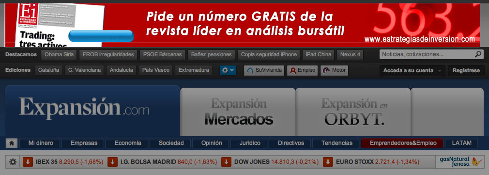
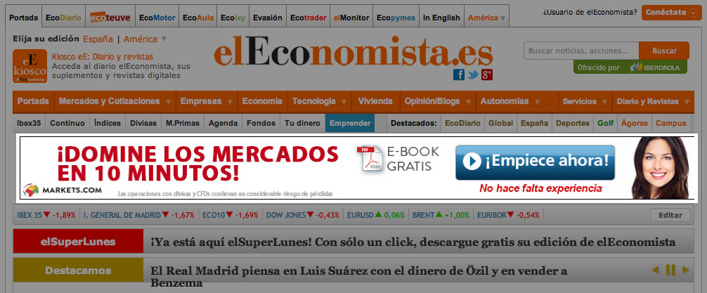
- Banner: In rectangular shape and horizontal orientation, often placed in the upper third of the page. There are three subformats that vary according to their dimensions. We have the megabanner (from 728 x 90 pixels to more than 900 pixels wide by 90 pixels high), the banner (468 x 60 pixels) and the half banner (234 x 60 or 234 x 90 pixels). In the case of the megabanner, it is often placed at the top of the web page, which makes it especially effective due to its high visibility.
- Robapages: This is a type of banner that integrates harmoniously into the design of a template, making it unobtrusive. It is usually placed next to the content of an article. It usually registers a slightly better CTR than a conventional rectangular banner. Its size varies from 300 x 250 pixels (in which case it is in landscape format) to 300 x 600 pixels (in which case it would be in portrait format).
- Skyscraper: Vertical rectangular banner with a size of 100 x 600 or 120 x 700 pixels. It is usually integrated in the side columns of the web page, or next to them.
Due to the constant progression of screen resolution, graphic formats tend to increase in size.
Main types of expandable graphic formats
The graphic formats defined by IAB Spain are similar to the integrated graphic formats. The difference with these is the ability to expand on the screen above the content to a format that varies according to the limitations of the support or media where it is integrated.
Note: for both integrated and expandable graphic formats, IAB Spain recommends that the weight of the digital files corresponding to each piece should not exceed 30kbs. This limitation in file size is justified by the need for a fast download if we want to offer a good user experience.
Main types of floating graphic formats
The most common floating graphic formats are the following:
- Interstitial: It is a banner that occupies the entire browser window (800 x 600 pixels). It is called interstitial because it usually appears between a user’s click on a link and the content to which the link pointed or before the download of the first page. Sometimes it is displayed on the website’s home page itself in a way that forces the user to click to skip the advertisement and access the content. By covering most of the visible area of the screen, interstitials are very effective in attracting the user’s attention. However, most of them find it intrusive. An abuse in the frequency of interstitial usually results in an increase in the bounce rate (users who close the browser or leave the site tired by the constant interruptions of navigation).
- Layer: This type of banner consists of an animated image that moves over the contents of the web page in which it is inserted. Its movement can be either anarchic, or until the user decides to click on it, or during a certain period of time. This format can generate high CTR ratios but, like interstitials, it is perceived as very intrusive.
Frequent exposure to display advertising on the Internet and the perception of certain formats as intrusive messages has provoked in users, as we have already mentioned, what is known as “banner blindness”. When we land on a page that includes advertising, our perception is very well trained to detect in milliseconds where the content we are really interested in is located and we ignore the rest.
This is why aspects such as size, format, frequency, location, affinity and degree of interactivity have a significant influence on banner visibility. Obviously, larger, above-the-fold formats that connect to the visitor’s profile are generally more effective than small buttons located in areas below the lower threshold of the screen.
The current trend in the advertising market favors the use of larger formats in accordance with the larger resolutions of the screens used by users. However, the most visible locations and the largest formats are usually also the most expensive, so we can’t always afford to appear in the most interesting areas.
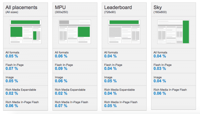
In the following image we can see the different effectiveness of a display ad depending on its format and location, taking as performance criteria the click-through rate obtained.
Since the performance of this type of advertising does not always translate into an immediate action in the form of a click on the ad, we can also consider other measures of effectiveness in terms of interaction. In this sense, we consider as interaction that the user performs any of the following actions:
- Place the pointer over the advertisement for more than one second: unconsciously, users tend to place the pointer where we direct our gaze, so we can infer a correlation between the action of placing the pointer over the ad and the user having received an effective impact from it.
- Clicking on the close mark: Although this action is related to the user’s intention to continue browsing, the simple fact of analyzing the ad to identify the close button indicates that the user was exposed to its impact.
- Have the ad displayed full screen: In video ad formats, indicates an interest in accessing the information in greater detail.
- Expand the ad: In expandable ad formats, it indicates an interest in expanding the information contained in the folded ad.
Banner design: aspects to consider
Once the banner format has been chosen, we move on to the design phase. There are some points to consider:
- The banner must load fast: we have already seen that banners should not exceed 30kb if they are fixed and 50kb for floating formats. In the case of interstitials, controlling the weight of the banner is especially critical because if it affects the loading time too much, something very frequent especially when accessing content from mobile terminals, this reduces the impact of the banner and also affects its CTR.
- Simple and direct messages: a banner is similar to a billboard in the sense that its design should be simple and not contain excessive text. A direct and impactful message is more effective than an exhaustive sales pitch.
- Check compatibility: It is important to check how the banner is displayed on a variety of browsers, operating systems and devices to ensure compatibility with most of the configurations that users will use to access it.
- Check that the link in the piece redirects to the appropriate landing page: an effective banner will present an advertising message with a unique selling proposition that must connect with one of the target’s buying motivations. The landing page must convince the user who clicked by complementing the sales argument and counter-arguing any possible objections. In this way, we increase the probability of achieving conversion.
- Include calls to action: If one of the objectives of the banner is to direct users to a landing page, we must include obvious calls to action, such as: “click here”, “learn more now”, etc. Additionally, adding a certain touch of urgency (“Limited units!”, “Only until May 31”, etc) increases the chances of a click.
- Test several versions: As with all Internet marketing tools, making several versions of the same ad is best for testing the banner design that elicits the most interest from our target audience. Try changing some graphic element in the banner and record the CTR and interaction ratios mentioned above that indicate a higher impact on the recipient.
Sources
- Banner format standards recommended by IAB Spain: https://iabspain.es/estandares/formatos/.
- Comparative CTR data for different advertising formats: https://www.smartinsights.com/internet-advertising/internet-advertising-analytics/display-advertising-clickthrough-rates/
- Design principles for better display advertising: https://www.wordstream.com/blog/ws/2018/07/30/design-principles.
- Banner design tips to improve CTR: https://99designs.es/blog/marketing-advertising/14-design-tips-for-more-clickable-banner-ads/
