Written by Fernando Maciá
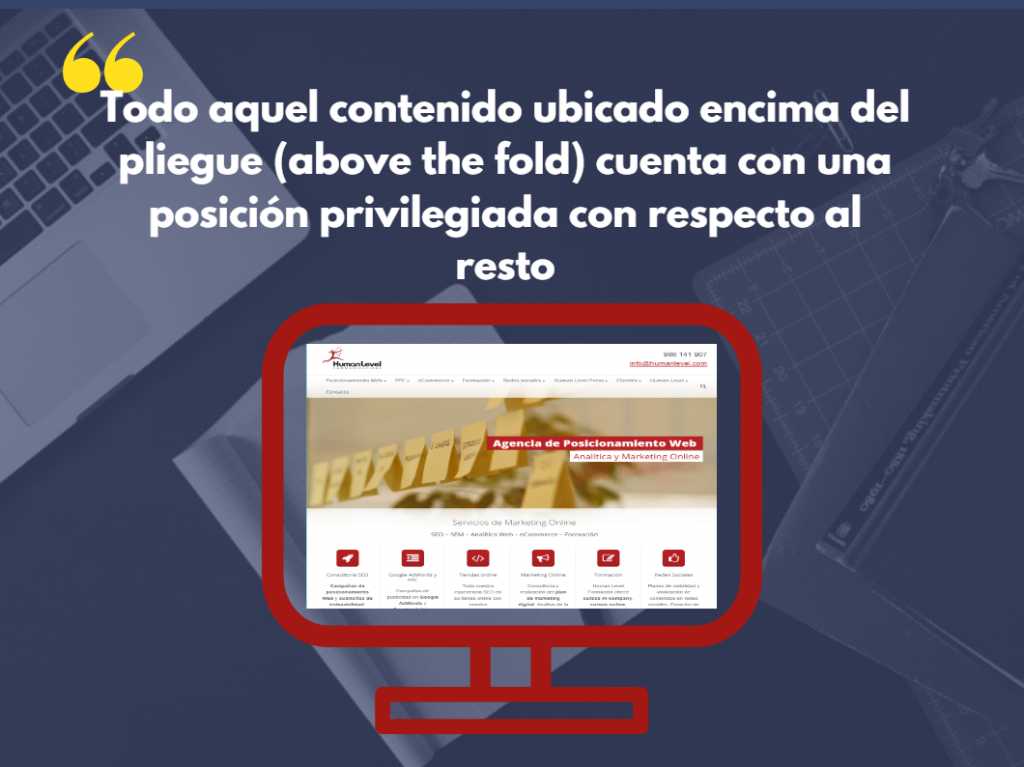
Above the Fold is the part of the web page that is visible after loading. Although this term is currently used in the field of online marketing, it was already used in the field of print media to indicate whether an advertisement appeared in a place on the website visible without the need to scroll.
Above the Fold is the section of a website that the user sees without having to scroll down with the mouse.
Any website has two distinct parts, on the one hand the upper part and, on the other hand, the lower part, also known as “below the fold“, that is, the part that we can only see if we scroll down.
As a general rule, the most relevant elements of the website, i.e., those that will capture the user’s attention from the first minute, are placed at the top of the page. This is to ensure that the user stays on the page as long as possible and does not leave it, thus reducing the bounce rate.
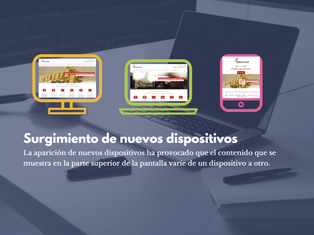
Emergence of new devices
But the emergence and birth of new Internet-enabled devices changed everything. Now this part of the page is not as relevant as it was before, since it now has a changing character, that is, it is modified depending on the device from which it is accessed.
A tablet does not have the same dimensions as a desktop computer and, therefore, we will not be able to see the same things. Therefore, the idea of keeping the most important elements at the top of the page has been losing strength over time and is falling into disuse.
The importance of taking care of the design of our website
In a scenario like the current one, in which the variety of devices makes it impossible to accurately measure the effectiveness of having the most relevant elements in the first part of the page, it is crucial to take care of the design of the page and keep it with an attractive appearance that encourages the user to continue browsing it. To do this, we must distribute the content evenly throughout the page, without concentrating the information at the top.
The header of our page should not contain a large amount of information, but should contain concise information
Practices to avoid during the design of our site:
- Insert all the content in the first part of the page.
- Include headers that are not very concise and with a large amount of information.
- Content that is not very attractive or not related to our business activity.
The first screenshot of a website is like the first impression we get of a person when we see them for the first time, that is, if we are not convinced from the first moment, we may not establish any kind of contact with them again. The same thing happens with websites, if the user accesses and does not like what he sees, he will not hesitate to leave and look for another page. What’s more, if they match your page again in any other related search they do, they won’t enter because they will already know what they are going to find.


