Written by Anastasia Kurmakaeva
Index
Last Tuesday, February 2, the company Yandex announced on its corporate blog the launch of its new algorithm, Vladivostok, whose operation would start to take effect immediately in the positioning within the search results throughout the territory of the Russian Federation. The reason Yandex developers have chosen this city to name the update after is because the Russian Far East region is a leader in internet usage from mobile devices.
What effect does the Vladivostok algorithm have on mobile positioning?
From this moment on, officially, and following Google’s steps, Yandex’ s robot will take more into account websites that offer a mobile-optimized version of their portals.and better positions in the market. rankingthan those that do not offer this option to the user. Obviously, this does not mean that websites that do not have a mobile version will no longer be displayed in the results, but they will enjoy lower priority for the Russian search engine. From now on, the adaptation of the mobile design becomes one of the many factors (more than 800) that Yandex takes into account when calculating the relevance of a website.
Yandex takes into account more than 800 factors for the calculation of the relevance of a website, to which is now added having a version optimized for mobile devices.
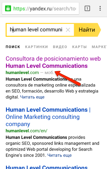
This update in the algorithm was already coming since the end of November 2015, when at its fourth Webmaster event Yandex announced that from that moment on the search engine would start displaying a small “mobile version” label next to pages that offered a mobile version in the results for users:
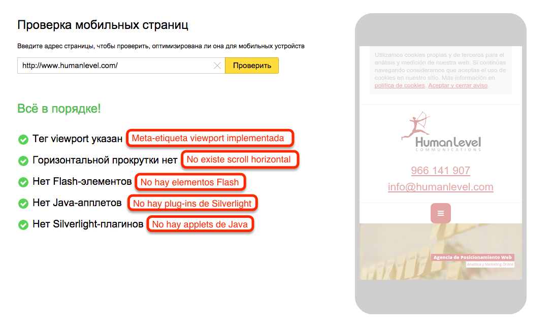
As a result, a new functionality was also introduced in the Yandex.Webmaster BETA, which made available to developers the possibility to check the correct adaptation to responsive design of their website for mobile devices. This quick analysis is able to detect in a matter of just a few minutes whether your website is suitable or unsuitable, establishing in detail if there are elements that prevent a correct visualization of it.
We have done the test with the home page of www.humanlevel.com and this is how the results are displayed when everything is in order and the web site is suitable:
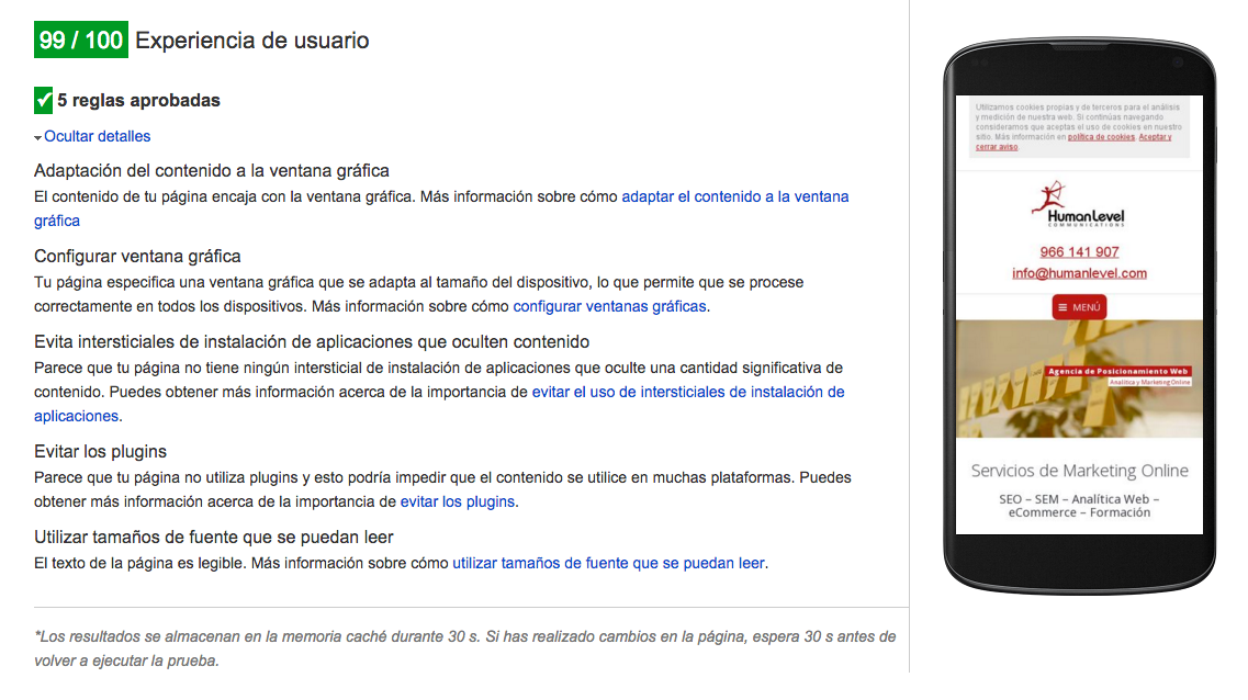
Google has two similar tools, Mobile Optimization Test and PageSpeed Insights, which check the same indicators, among many others. This is the test we performed for the same website with the PageSpeed Insights tool:
Please note that in order to check with Yandex, you must have permissions to access the Yandex.Webmaster tool data for a given website. However, Google allows you to perform this check for the website of your choice.
At the moment, Yandex’s mobile adaptation is particularly focused on users searching from their smartphones, but work is also underway to implement this update on tablets and other similar devices. In the coming months, the update is expected to be rolled out in other countries where Yandex is predominantly used, including Belarus, Ukraine, Kazakhstan and Turkey.
To stay one step ahead of the Russian search engine, and not to be caught by surprise by the new features that will be introduced soon in this aspect, we will take advantage of this article to learn how to properly optimize a website for mobile on Yandex.
Only 18% of the most visited websites in Russia currently have a mobile version implemented on their portals.
A priori, according to the first wave of checks carried out by Yandex experts, out of one million of the most visited websites of the runet only 18% are currently adapted with a design that is responsiveIf you have a portal that is positioning itself in the Russian market, there is still time to apply the relevant recommendations.
Yandex recommendations to optimize your website for mobile devices
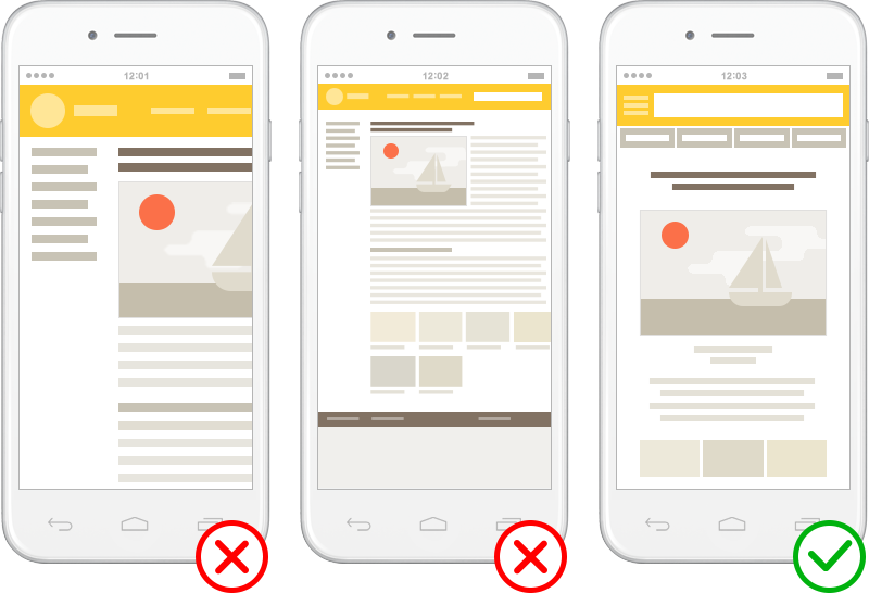
Adaptation of the content to the graphic window
That is to say, the content is laid out so that it fits within the horizontal limits of the user’s screenand can only be done scroll down or up the page, without having to scroll sideways to access information, view an image or read text.
For websites that use responsive design you can make use of the meta viewport, as follows:
<meta name=”viewport” content=”width=device-width, initial-scale=1″>
It is also recommended to indicate with a link rel=”alternate” element the pages that have a mobile version, for example:
<link rel=”alternate” media=”only screen and (max-width: 640px)” href=”http://m.humanlevel.com/page.html”/>
Use of Flash, Silverlight or Java Applets
It is strongly recommended to avoid the use of this type of elements, since in most cases they are incompatible with the browsers of mobile devices. If you want to add interactive content, such as videos, you can use HTML5, which is supported.
Font and image size
The font size must be perfectly legible on a mobile device, comfortably and effortlessly for the user. The images should also not go outside the horizontal limits of the screen.
