Written by Rubén Martínez
A stage for everyone
SEO experts are used to working in scenarios in which we have a large number of pieces that we must fit into a specific place, comparable to the gears that make an engine run.
In a speed race, an engine built with the best parts arranged in the most optimal way will have a serious chance of winning the title. Similarly, in the search engine ranking, those websites with the best optimization of their gears will opt to appear in the highest positions.
Today I want to talk not only about SEO, but also about the concept of Web Accessibility, with special emphasis on those points where both disciplines meet.
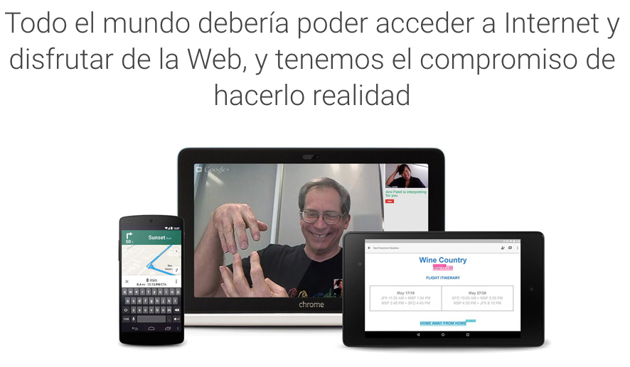
Web accessibility refers to the fact that any web page can be perceived, understood and navigable for the greatest number of people.
To this end, I accompany this article with an interesting interview I conducted with José María Fernández, expert in Accessible Technologies and Software Developer at the University of Alicante.
Here is our interview:
Web accessibility refers to the fact that any web page can be perceived, understood and navigated by as many people as possible.
That is to say, that regardless of the device used (tablet, cell phone, computer, screen reader of a blind person), the physical or sensory capabilities a person has, external conditions (low speed internet, low light situations, etc.), optimal access to the contents of the website is possible.
An accessible web page will be one that:
- Layout the content with sufficient line spacing and do not justify the text on both sides.
- Have all links with their own meaning (no “Click here” or similar).
- Use headings to structure the information and provide navigation mechanisms through the different sections with menus and/or content indexes.
- Allow keyboard navigation for those who cannot use the mouse.
- Provide written description to visual elements such as images (alt attribute) or tables (caption tag).
- Include videos with subtitles.
- Have sufficient contrast between text and background color and the possibility of using different color combinations to improve contrasts.
- Allow and/or have buttons to increase the size of text or images without loss of quality.
Yes, we should think that our website will reach as many people as possible. It is estimated that there are 4 million people with some type of disability in Spain and more than 1 billion worldwide. They are potential users or customers of our website, so if we do not take them into account, we will be losing good business opportunities.
No, the other way around. It is often said that Google is the richest blind user in the world. Keep in mind that Google’s robot does not see, so it crawls a website in a similar way as a blind person, it needs the alternative text of an image to know what information it provides. You need the hierarchy of headings to know how the page is structured and which are its most important sections. Likewise, a link with the anchor text “click here” tells you nothing, just as it would tell nothing to a person who cannot see.
For this reason, if a web page is accessible, Google will understand it better and will therefore be able to position it in a better way.
On the other hand, it is true that on many occasions important things are not taken into account, such as hiding content on cell phones incorrectly, which visually are not there but for example a screen reader used by a blind person will be.
On the one hand, yes. The terms accessibility and usability go hand in hand. The emergence of the mobile web has also had a lot to do with this, whose optimization focuses on the clarity and conciseness of content, as well as easy web navigation.
Before, there was the idea that the user had 5 seconds to decide whether to stay on our page or not, and we tried to accumulate all the content at the top, which made it difficult to understand the website. Now the user has developed more patience by getting used to scroll vertically with the mobile to almost infinity.
However, everything has a but. In this case, hamburger menus, which display the content when clicked on, are increasingly being used. It happens that many times they are programmed to be used only with the mouse, therefore, people who only use the keyboard to navigate cannot access these contents.
Yes. As I indicated in the previous question, websites are now generally simpler and show only the most relevant information, making it easier to search for and understand content.
It depends on the platform and its integration with the system. On Android the king is Chrome, but on iOS it’s Safari. On Windows it is different, Firefox or Internet Explorer are more accessible and on macOS it is Safari.
This is because the assistive technologies used by people with disabilities to surf the web (screen reader, screen magnifier, etc.) are usually created by the OS manufacturer, thus providing them with greater compatibility and accessibility features.
Every user has his or her own tricks. For example, a person with low vision configures his or her browser to force the minimum font size and font type to always be the same. In this way, regardless of the font type and size we use, the user can always see Arial type and size 18. This is why it is important to layout in relative and not absolute measures, so that the content adapts to it.
The same is true for people who suffer from color blindness or contrast problems. They create their own style sheets to apply their rules and view the page with color inversion or similar.
All websites should incorporate basic buttons to increase/decrease the size of text or images, or apply color filters, such as white on black.
Tests should be conducted with users with disabilities to detect problems with our websites or to learn from them. Any developer should be aware of the tools used by people with disabilities, explore them and get an idea of how people with sensory impairments navigate.
We all have these technologies in our smartphones. Simply go to Settings -> Accessibility, whether on Android or iOS, we have magnifiers to enlarge the screen, apply high contrast filters, use long keystrokes for people with motor impairments or screen reader to hear how a blind person reads the content of a website; on Android it is called TalkBack and on iOS VoiceOver.
In Windows, the NVDA screen reader is used, which is free, open source and allows you to get an idea of how a blind person navigates the web.
In addition, there are extensions in Firefox and Chrome browsers to do accessibility analysis, such as Accessibility Toolbar, WCAG Contrast Checker and more.
There are the Web Content Accessibility Guidelines (WCAG) in its version 2.0 which are the standards that a web page should follow to be accessible. Spanish legislation requires that the websites of public administrations, companies dependent on them or companies with a turnover of more than 1 million euros, are obliged to make their websites accessible, and may face fines of up to 1 million euros.
Websites of El Corte Inglés, Jazztel or Iberia have already been penalized for this.
Yes, and we learned a lot from each other.
It is very important and will become more so in the future. The population is getting older and will bring new people with vision and comprehension problems. Likewise, the use of so many screens and headsets will increase the number of people with disabilities in these areas even more.
Having a specialist to test with users, to test the web with different technologies used by people with disabilities or to automate web accessibility analysis is a good investment. At the end you will also be doing layout work, so a layout designer could already be required to have web accessibility concepts.
The website should have a descriptive title and provide navigation links and h1-h6 headings that allow you to get an idea of what the content of the page is. This way you will be able to navigate through it, know what it is about and go deeper in case you are interested.
Yes, Spain is at the level of Europe, maybe even above the European average. In the USA and Canada, more results are achieved thanks to the large amount of resources they invest in research. If we had a decent level of R&D&I in accessible technologies, we would undoubtedly be a world leader in this field.
There is the case of Luz Rello, a Catalan researcher with Dyslexia who has had to emigrate to the USA to carry out her studies on this specialty, developing Apps for detecting dyslexia in children, games to stimulate it, etc. Unfortunately, in Spain, results are required at too early a stage of research, which clearly makes it impossible to reach valuable conclusions.
Tools such as https://www.tawdis.net tell us what we have right and wrong and help us to solve the accessibility problems encountered, even providing code examples.
Some browser extensions:
- Accessibility Toolbar: Extension for browsers that allows you to disable mouse events for similar only the use of the web with keyboard, check headers, accessibility of tables, check if the images have alternative text, etc etc etc.
- WCAG Contrast checker: This extension tells us if the color combinations between background and text meet the accessibility requirements.
- Headings: Shows us the headings of our web site and if they are correct in their hierarchy.
- WAVE: It is an extension that allows us to make accessibility analysis of web sites giving us a lot of information.
Google’s robot does not see, so it crawls a website in a similar way as a blind person.
Conclusions
At this point it is possible to draw valuable conclusions regarding two disciplines that, a priori, may appear to be independent but are in fact closely related.
We found many points in commonsuch as hidden content that can be penalized, intuitive and consistent navigation, readability, mobile usability, predictable navigation, voice searches, alternative content in text mode (alt attributes) or the limited use of JavaScript resources that may hinder navigation if disabled.
SEO and Web Accessibility are advancing by leaps and bounds, developing more and more by sharing paths that run through the user experience during navigation. Web technology is approaching users with disabilities and in this progress, it is trying to find an optimal scenario for all individuals who browse the Internet regardless of their abilities or impairments.
Do you optimize for all types of users?
