Written by Ramón Saquete
Index
The way to include images within HTML code has constantly evolved in recent years to meet the demands of performance and display on different devices, becoming a more complex task. Next, we will look at what features are desirable in optimal image loading and how to achieve them with currently available standards.
First let’s look at a list of all the problems we should address when loading an image and then we will see how they are solved.
List of desirable characteristics of an image in an optimized website
A seemingly simple task such as displaying an image can be more complicated than it may seem at first glance if we want to do it right.
These are difficult objectives to meet and to do so we must take into account the following points:
- The image must be easily indexed by any spider with or without JavaScript. In the case of Google, we will have a first indexing pass without JavaScript and a possible second pass with JavaScript.
- There must be an SEO alternative text to be displayed if an error occurs when loading the image.
- We need different image sizes for different screen sizes and resolutions, so that the image is displayed correctly on any device.

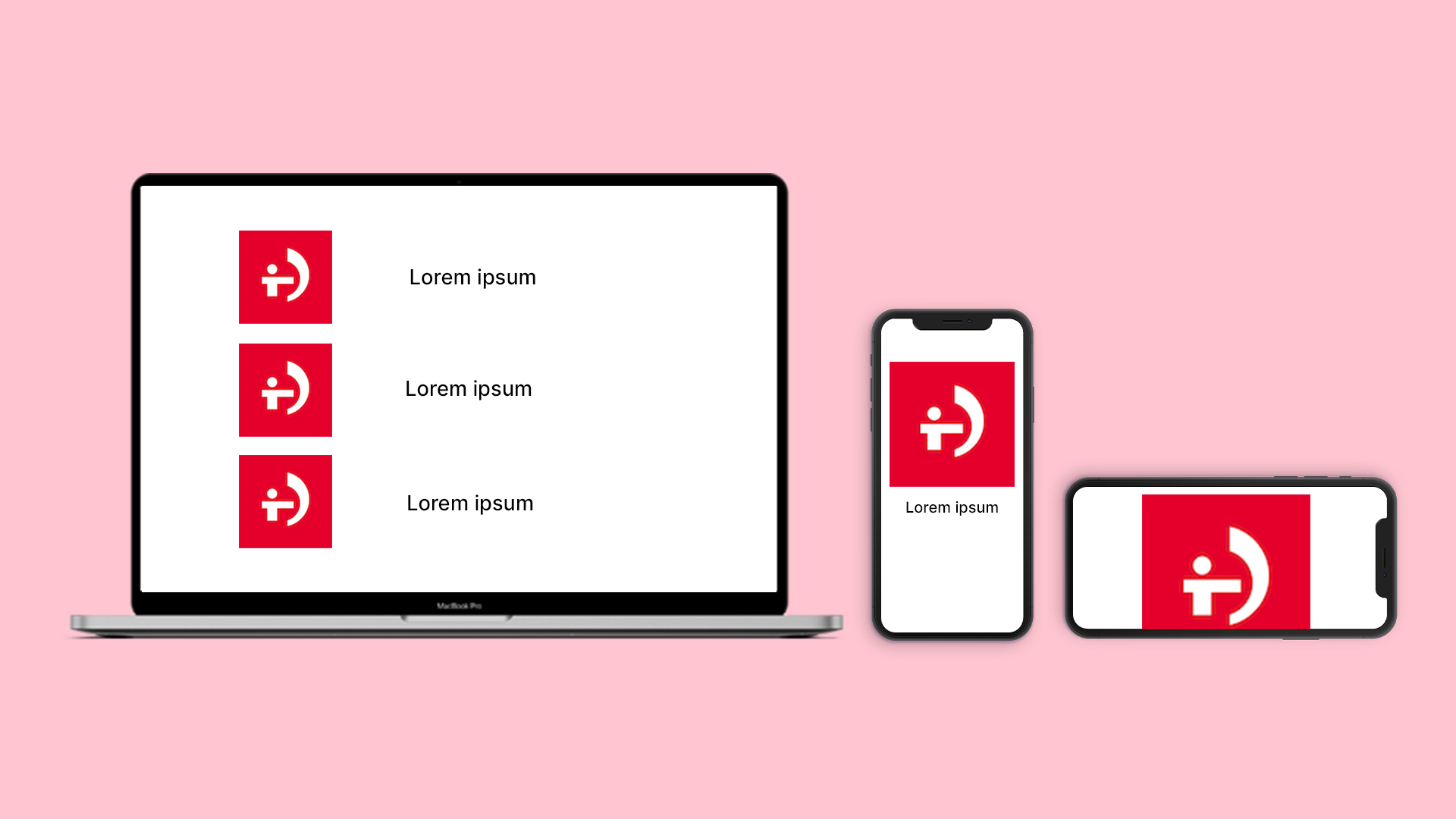
The representation shows how responsive images require different sizes depending on the layout and the device used. - Image compression must be optimal. To do so, we must:
- Correctly select the most suitable image format and adjust the saving parameters to the type of image.
- Have a WebP optimized version available for each image size. This format is currently supported in all browsers except Safari, where support is currently partial.
- For Safari we might have a JPEG 2000 optimized version available, but it is only a matter of time before this browser also fully supports WebP.
- The saving options (progressive JPEG or interlaced PNG) should be set to display a preview of the image while loading.
- The image must not displace the content below it when it loads. To avoid this, we must specify any of the sizes used with the attributes width and height, so that the browser can calculate the proportion of the height of the image.
- The recommendation in the previous point does not work when we have browser versions between 2010 and the beginning of 2020, when the use of these attributes is no longer recommended. It also does not work with certain implementations of the lazy load technique and when changing the image ratio according to the screen size. In such cases it is better to use the CSS Ratio Boxes technique with which, in addition, we can fill the gap where it will be displayed with the predominant color of the image.
- The loading of non-critical images (below the fold) should be delayed, so that they do not interfere with the download of critical elements (above the fold). This is known as lazy load, and consists of not loading the images until they enter the user’s viewing area.
- Normally, it is not recommended to frontload critical images, since images are not as critical resources as CSS and JavaScript, but we will see how we can frontload them a bit by avoiding applying the lazy load technique.
Technical implementation
Combining all the recommendations we would have to implement the images following these rules:
- Write the SEO text of the alt attribute of the <img tag>.
- Using the elements <picture> and <source> to specify images in Webp with the attribute type=”image/webp”, keeping within <picture> the element <img> for those browsers that do not support this format, and have the alternative text.
- Apply the srcset attribute in the elements <img> and <source> to specify the different image sizes, both in Webp and in the alternative format. Here we will include the width in pixels of each image in the format “[nombre archivo] [ancho]w”.
- Include the attributes width and height inside <img> to reserve the height ratio.
- Use the loading attribute of <img> for the lazy load technique.
- Define the values of the sizes attribute to specify the width that the image occupies in each slice of the responsive layout, which can be a fixed size in pixels or a percentage with respect to the viewport. This attribute is necessary for the browser to know the width that the image will occupy before loading the CSS and thus be able to choose the most appropriate size from those available in the srcset attribute. If not specified, the browser assumes that it occupies 100% of the viewport and may load a larger size than necessary.
In addition, as an example, additional layout elements have been added to implement the technique. CSS Ratio Boxes, to reserve the height and put a background color, before the image is loaded, in case the browser does not support the reservation of the proportion of the height with width and height (however, we leave these attributes so that PageSpeed does not give us a bad mark if they are missing):
<style>
.wrap-img{
    position:relative;
}

.wrap-img div{
    padding-top:56.5%;
    background: #ccc;
}

.wrap-img picture{
    position:absolute;
    top:0;
}
</style>
<div class="wrap-img">
    <div></div>
    <picture>
        <source type="image/webp"
         srcset="/img/img600x339.webp 600w, /img/img300x170.webp 300w, /img/img250x141.webp 250w, /img/img1200x678.webp 1200w"
         sizes="(max-width:768px) 93vw, (max-width: 975px) 59vw, 600px" />
        <img width="600" height="339"
         src="/img/img1200x678.jpg"
         srcset="/img/img600x339.jpg 600w, /img/img300x170.jpg 300w, /img/img250x141.jpg 250w, /img/img1200x678.jpg 1200w"
         sizes="(max-width:768px) 93vw, (max-width: 975px) 59vw, 600px"
         alt="Texto SEO"
         loading="lazy" />
    </picture>
</div>
If the image is above the fold, we will use the loading=”eager” attribute (instead of loading=”lazy”) to avoid applying the delayed loading by JavaScript.
Lazy load by JavaScript without losing indexability
As the loading attribute is not yet supported by all browsers, only if we want to support them, we can apply the following implementation with JavaScript (only to images below the fold).
The HTML code of the image with lazy load would be as in the following example, replacing the src and srcset attributes by data attributes (data-src and data-srcset respectively) and adding to <img> the class used by the library to perform the load by lazy load (class=”lazyload”). We also add the attribute <noscript>, so as not to lose indexability, since spiders will look for images in the src and srcset attributes, not in data-src and data-srcset:
<picture>
    <source type="image/webp" data-srcset="/img/img600x339.webp 600w, /img/img300x170.webp 300w, /img/img250x141.webp 250w, /img/img1200x678.webp 1200w" sizes="(max-width:768px) 93vw, (max-width: 975px) 59vw, 600px" />
    <img width="600" height="339" data-src="/img/img1200x678.jpg" data-srcset="/img/img600x339.jpg 600w, /img/img300x170.jpg 300w, /img/img250x141.jpg 250w, /img/img1200x678.jpg 1200w" sizes="(max-width:768px) 93vw, (max-width: 975px) 59vw, 600px" alt="Texto SEO" loading="lazy" class="lazyload" />
</picture>
<noscript>
<picture>
    <source type="image/webp" srcset="/img/img600x339.webp 600w, /img/img300x170.webp 300w, /img/img250x141.webp 250w, /img/img1200x678.webp 1200w" sizes="(max-width:768px) 93vw, (max-width: 975px) 59vw, 600px" />
    <img width="600" height="339" src="/img/img1200x678.jpg" srcset="/img/img600x339.jpg 600w, /img/img300x170.jpg 300w, /img/img250x141.jpg 250w, /img/img1200x678.jpg 1200w" sizes="(max-width:768px) 93vw, (max-width: 975px) 59vw, 600px" alt="Texto SEO" loading="lazy"  />
</picture>
</noscript>
JavaScript code:
//si el atributo loading está soportado por el navegador, cambiamos los atributos data por sus homólogos
if ('loading' in HTMLImageElement.prototype) {
    const images = document.querySelectorAll('img[loading="lazy"]');
    images.forEach(img => {
        img.src = img.dataset.src;
        img.srcset = img.dataset.srcset;
        //obentemos padre y elementos source
        var source = img.parentElement.getElementsByTagName("source")[0];
        source.src = source.dataset.src;
        source.srcset = source.dataset.srcset;
    });
} else {
    // si no está soportado por el navegador cargamos un polyfill (lazysizes)
    const script = document.createElement('script');
    script.src =
      'https://cdnjs.cloudflare.com/ajax/libs/lazysizes/5.1.2/lazysizes.min.js';
     document.body.appendChild(script);
}
The lazysizes library, when it detects the Google bot in the user-agent, displays all images without lazy load, so Google will have no problem indexing the image with this implementation. The Google bot will see the image in the <noscript> attribute on the first pass (without JavaScript) it will see the image in the <noscript> attribute and on the second pass (with JavaScript), it will also see it.
However, Google does not seem to have problems indexing other, less spider-considered implementations of lazy load (without the <noscript> and without disabling user-agent delayed loading), but if we really want to be sure that Google and other spiders will not have problems, it is preferable to use the implementation discussed here.
How to load multiple sizes if the image works by CSS?
Currently, the most compatible way to load an image by CSS for all browsers is to specify the different sizes with half resolution queries.
For example:
.ejemplo{
    background-image:url(img1x.jpg);
}

@media (-webkit-min-device-pixel-ratio: 2), (min-resolution: 192dpi) {
    .ejemplo{
        background-image:url(img2x.jpg);
    }
}
The unit used in the example (dpi), are dots per inch, where a single resolution screen or with 1 to 1 correspondence in CSS pixels, would have 96 dpis, so in the example the image is loaded when the screen is at least double resolution (192/2= 96).
This will have to be combined with the media queries that take into account the screen size (max-width or min-width), to load the most appropriate sizes in each case.
This implementation is much more cumbersome than HTML and may force us to set the same image several times for different situations. When the CSS specification evolves further, it may change the way it is implemented to a simpler one.
To combine this code with Webp images, there is no choice but to detect with JavaScript if the browser supports Webp and, depending on whether it supports it or not, change the class used in the images by applying different CSS rules in each case.
For example, we can use the Modernizr library (including only webp detection or whatever we need to detect).
Example:
.no-webp .ejemplo{
    background-image:url(img1x.jpg);
}
.webp .ejemplo{
    background-image:url(img1x.webp);
}
Similarly, we can implement the lazy load technique, adding a different class to the images included in the display area by JavaScript.
How to choose the appropriate image sizes?
The layout of the images can be done in three ways:
- Defining a fixed size for each screen width range.
- Defining screen width ranges in which the image occupies a percentage of the screen.
- Combining the two previous options. This option is the most commonly used, being the most common to have a fixed size on desktop and a variable size, based on a percentage, on mobile.
It should be noted that on mobiles and tablets images use virtual pixels or CSS pixels, which means that for an image with a width of 1,200 pixels to display perfectly on a large tablet with triple resolution retina display, that image should to be 1,200 x 3 = 3,400 pixels wide. This is the case where larger images are needed, but we will not take into account triple resolution screens, since this would mean having images with an excessively large weight and the human eye won’t be able to appreciate the difference. We will generate versions for double resolution screens or lower.
Taking all this into account, we can define the strategy for choosing the different sizes, which consists of the following steps:
- If the layout uses fixed sizes, we would start by generating as many versions as we have different fixed sizes, so that each one occupies exactly each of those sizes.
- If the layout uses variable sizes depending on a percentage, it will be necessary to take into account which will be the largest and which the smallest space that the image is going to occupy, along each screen size range or responsive layout slices, generating one version of the image for the largest and one for the smallest space in each range without repeating sizes that are very similar.
- Then, for the version with the larger size, we will generate an image twice the size, since we want these images to be displayed correctly on double resolution screens.
- Once we have all the versions of previous sizes, we should try to generate versions for the different intermediate sizes, in an equal way so that there is not too much difference between each one of them. Although here, depending on the case, we could give priority to generate more different sizes for the versions to be used on mobile.
Following these steps, we can get to have approximately 6 to 8 versions of sizes for an image that has to be seen occupying the entire mobile screen. If it does not occupy the entire screen, you will get fewer different sizes or even only 1 or 2, if it is a small image.
Conclusions
Given the continuous evolution of web development, if you have a website, it is more than likely that the way you include images in it needs to be updated.
The way to include responsive images in the HTML code is already in a fairly mature state, covering the list of desirable features we have specified and some more, such as being able to choose an image with different proportions for each screen size (a case we have not covered in this article). The CSS specification, on the other hand, needs to evolve further in order to facilitate the inclusion of responsive and Webp images in a simple way and without having to use JavaScript.


