Written by Fernando Maciá
Call to Action (CTA) is a term widely used in marketing, which refers to those literal or graphic elements that serve to attract a user to perform a specific action immediately. The “action” we want them to perform can range from something as simple as subscribing to a newsletter or downloading a song, to buying a product, hiring a service, requesting a trial version of a program or application, participating in a contest, and a long etcetera.
Call to Action examples
They can appear in the body of the main text or content, or they can appear in separate modules, in the header, in the footer, in the sidebar…
If, for example, we are offering some kind of service, we can find a call to action in the header, such as our customer service phone number and a “Call now!” invitation.
This CTA can include a link to our phone, especially convenient for customers browsing from their cell phone, since they only have to click and the website will redirect them to the corresponding application that will automatically dial the number.
On websites that require you to be logged in, you will see calls to action to register or log in. For example:
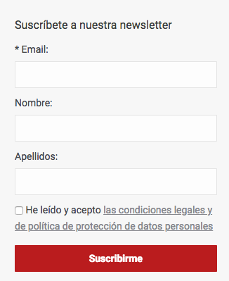
Subscription to a newsletter:
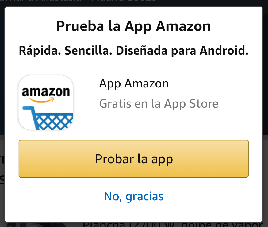
Amazon, when we enter its website from a mobile device, invites us to download its application, which also combines with an interstitial:
It also customizes it according to the operating system we use.
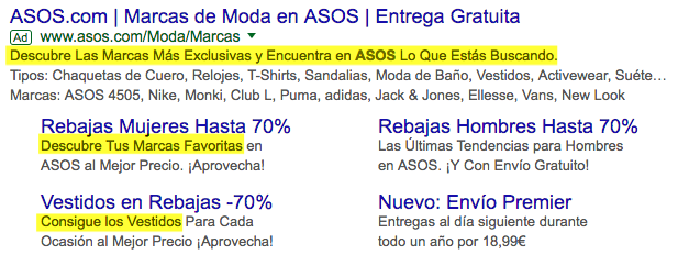
We also often encounter Call to Action in search results – both organic and paid – particularly in meta descriptions. It is very common to see combinations of the type:
- “Enter our online store and discover…”
- “Explore our catalog of…”
- “Read this article about…”
- “Find out more about our services of…”
All these phrases encourage the user to click on a result, and in this way, the website earns their visit.
Actually, the main objective of a good CTA is to get the click, no more, no less. And, for this to happen, the call to action must be eye-catching and persuasive, offering a clear value proposition, something that will incite the user to act and be converted.
How to create an effective call to action?
An effective call to action is a combination of good design, writing and proper placement on the page. To do this correctly, we need first-hand knowledge:
- The purpose of the button or link. What kind of conversion do you want to achieve? A visit, purchase, download, subscription…?
- The target to which it is directed. It is important to know how to properly identify your audience, their preferences, concerns, interests… and design the CTA based on all these aspects.
Done well, calls to action are a truly effective technique in any industry. Don’t forget:
- Your proposal must have value for the user you are addressing. Otherwise, no matter how special it may be, if it does not meet some of your user’s needs, it will eventually go unnoticed.
- In addition to offering value, you must find a way to make your proposal tempt them and make it more attractive than that of your competitors, whether it is a better design, greater ease of use… You must know your strengths first hand and make the most of them.
- Data, numbers, statistics… all of them are elements that contribute to reinforce your proposal. Be specific in what your user will get if he/she performs the expected action.
- We have told you to be specific, but you must also be brief and to the point. It concretizes without preamble the purpose of the CTA.
- The element of urgency has proven to be very effective. Introduce it in your copy, either with phrases such as “last places!” or “the first 10 […] will get […]”. “Only 2 left […]! Use a little imagination and think about the argument that could make your users rush to perform the action.
References:
- Call to Action explained in the blog at SEMRush Spain.


