Written by Manuel Barrios Carrasco
Index
- 1.- Not knowing the status of your mobile website:
- 2.- Do not differentiate the user in mobile:
- 3.- Not thinking about mobile usability:
- 4.- Not making the right choice of the type of mobile web:
- 5.- Not following good practices for mobile SEO:
- 6.- Do not measure or analyze:
- 7.- Not understanding mobile SEO within the Global Strategy:
Mobile is not a trend: the world has become a multi-device connection of which practically all of us are a part. It is such an extreme social phenomenon that nowadays anyone leaves home without their keys, without money or even without their partner, but never without their cell phone, that inseparable companion.
We continually see in social networks or blog posts phrases like:
Mobile is in fashion, this is the year of the mobile. Google now takes mobile searches into account
We are becoming more and more technologically equipped and the sale and average time of use of mobile devices is increasing year by year. Whether through Apps or using the browser, the growth is continuous. We can see figures of this growth in the VI annual mobile marketing study conducted by the IAB for last year.
It is not a fad, it is a reality and a digital strategy is not understood without the mobile being integrated into it . Therefore, if you have a website and want to optimize it, you can not leave aside our beloved mobile devices. Within your mobile strategy, one of the most important factors will be mobile SEO.
From this article we will try to give you a hand by reviewing certain mistakes in the development of your SEO Mobile strategy that you should avoid making.
1.- Not knowing the status of your mobile website:
Recognize the status of your page for these devices, check fundamental indexes such as:
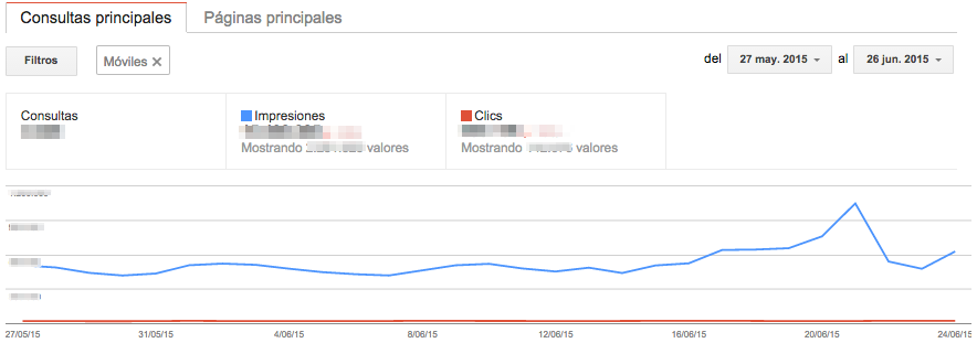
- Visibility in mobile search: know and compare the increase or decrease of your visibility for searches on mobile devices.
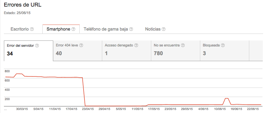
- Crawlability of these searches: how does Google crawl them, are there errors in the crawl, what content is being indexed?
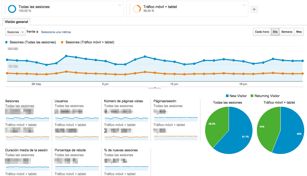
- Total vs. organic traffic and by devices: collects and compares total traffic vs. traffic received through organic searches. It measures the same by differentiating according to the type of device. Learn, follow its evolution, observe possible patterns.
- Comparison with desktop and with the competition: it is important to know our situation both on mobile devices and on desktop, to see what weight each one has in order to define our strategy and where to invest more effort. And of course, never forget where our competition is.
Tools we can use to gain this knowledge:
Google Search Console
Formerly known as Google Webmaster Tools, with Google Search Console we can crawl the site as Google ‘ s Googlebot-mobile would do, see the errors that occur in such crawling in the mobile version, the main queries in them and thus identify problems.
Google Analytics
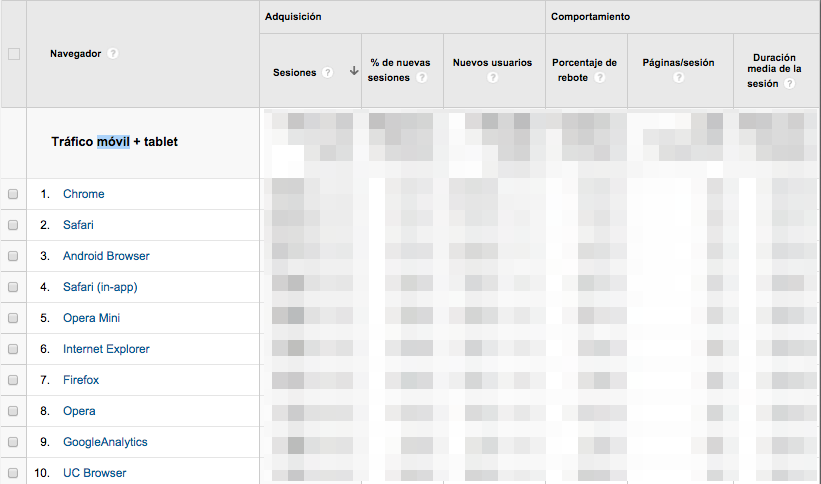
With this tool you will be able to study the mobile traffic of your website and compare it with the rest of the sessions, both in terms of volume and trends. You can view these metrics segmented by device and even see the performance of your landing pages from mobile visits. Let’s compare with desktop, let’s extract knowledge from the behavior of the users who visit us.
Emulators or user-agent switchers
Check how your site looks on any device, analyze your strengths and weaknesses according to what you find. You don’t need to have those devices to check it, take advantage of the tools. Detect how your titles, descriptions, URLs, snippets, competitors, and both will be viewed from mobile, tablet or desktop search results.
Screaming Frog
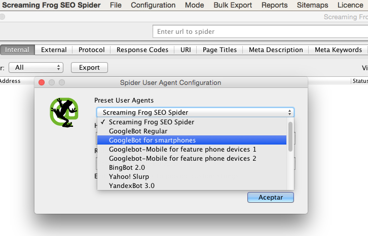
You can simulate the googlebot-mobile crawl and check the result. Once analyzed you have the possibility to review all your Hn hierarchical tags, titles, descriptions, keywords. Verify the existence or lack of duplicates. You can check redirects or uses of the canonical link element, inbound and outbound links of each URL, etc. You get a lot of good information to contrast with the information found in Google and its tools.
Moz Toolbar
Use it to see the popularity of your top-ranked mobile pages. Pagerank, page authority, domain authority, links, etc.
2.- Do not differentiate the user in mobile:

- User experience: the key is to add value, improve their experience, attract them, understand them. This is a differentiating element.
- Independence: the user manages on the fly. Don’t complicate it, guide it and facilitate its navigation.
- Convenience: we need to provide simple solutions that save time and effort for the user.
- Relevance: the context is fundamental and we must be relevant in that context.
- Security and transparency: the user must have confidence in our website because, in addition to being secure, it gives the user the option to compare. When they interact with it, for example by buying or subscribing to a newsletter, we must give them the option to confirm that they have made the right choice, give them the possibility to compare.
- Location: the user is on the move, local searches are gaining weight, think about this when providing alternatives.
Tools that help us define our audience
According to these factors, and wanting to customize our website adapting it to the user who comes to us through these devices, we can use the following tools to define our audience well:
Google AdWords Keyword Planner
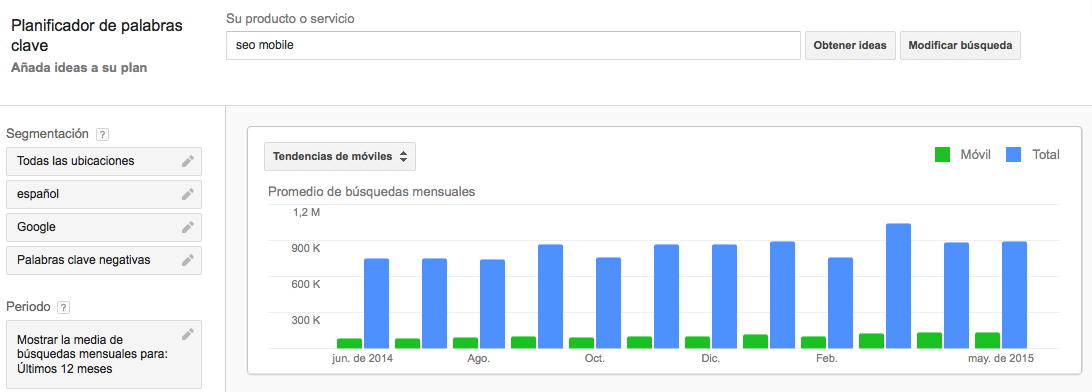
You can see the volume of mobile searches, identify possible keywords that your competitors are using and combine the knowledge extracted from Google Analytics, Search Console and AdWords to know more accurately the keywords with more potential that will help improve your positioning.
SEMRush and Sistrix
They will help you keep track of your keywords, their positions, keyword volume in top20, top100, related keywords, competition… In short, they will be useful for you to complete your keyword research and monitoring.
Advanced Web Ranking
With this tool we can create mobile campaigns and track the evolution of our keywords through keyword rankings. You can make an exhaustive follow-up since it indicates the variations of positions, it can send you reports with the cadence that you set, and even choose the format of those reports. In short, it is all about monitoring the evolution and status of your keywords.
 3.- Not thinking about mobile usability:
Don’t forget that once you have defined your mobile audience, you must be adapted to ensure that their navigation is satisfactory. Keep it in mind when thinking about:
- Content: providing information that is practical, accessible and relevant through an optimized architecture.
- Functionalities adapted to the type of searches: comprehensible, stable, with logical navigation mechanisms, appropriate language.
- Flexibility and efficiency: all of this without errors, complying with W3C standards, security, performance, download times, WPO, etc.
- Accessibility: from any browser, device, for low speed connections, screen widths…
- Having a correct web prototyping.
 4.- Not making the right choice of the type of mobile web:
If you want to adapt your website to tablets and mobiles you will have three options. I recommend you to read the previous post on how to improve mobile SEO in which Fernando Maciá explains the advantages and disadvantages of them and how to strengthen the optimization of your Mobile SEO.
- Responsive design or responsive design: preferred by Google, the same content for mobile and desktop, a website with a single URL. The server always sends the same HTML code, regardless of the device, and it is the CSS that modifies the page processing accordingly.
- Mobile-specific website: either through dynamic HTML or through a separate website with its own specific domain or subdomain.
- Applications
You must study your content, your audience and your development capacity, as well as the economic resources you have, when choosing your option. Select the one that best suits your needs and resources. Here you can see more about how Google recommends a responsive web design in their mobile guide.
 5.- Not following good practices for mobile SEO:
You can see this best practices guide for mobile site development developed by Google, along with a checklist of improvements for these sites. Read it, keep it in mind and review these points:
- Respect the user’s choice: once they have landed on your website, we have detected their device and they have been served the optimal web option, give them the possibility, if you have a website for mobile and another for computers, to choose which one they want to consult from their device.
- Develop to the effect: respecting the good practice in terms of not using FLASH elements or those that do not display or do so causing a negative user experience to our audience.
- Run, run, run: speed is of the essence, the user wants the web here and now. The speed of the server and the web must be optimal. Be sure to use tools such as Google’s PageSpeed Insights, or others such as Pingdom Tools, GTmetrix, WebPageTest, etc.
- Use structured data: a well-structured visibility makes it easier for the spider to find all the paths in its crawl. Google introduced in 2012 the Knowledge graph, or knowledge graph, an accumulation of knowledge for use in providing complementary information in conventional search results. It draws on structured information from trusted sources and content organized either in tables, lists or with semantic markup. You can see more about it at Schema.org
- SOLOMO: Don’t forget the social networks, the web is SOcial, LOcal, MOBILE, your presence in them will not be a positioning factor but it will help you to grow in visibility and to share your content. You will be able to reach more audience, be more relevant, achieve a social, open and 21st century brand image. Take care of your social networks, their profiles, give access from your mobile web. Work on those that are relevant to your business or objective, and don’t forget Google+, especially if your website is a local business.
 6.- Do not measure or analyze:
Information is power: gather it, analyze it and convert all that power into knowledge.
- Track exclusively mobile: check your rankings, traffic, conversions and all those KPIs you have previously established. You have a strategy defined, you have a tactical plan in place and you have the data, how can you think of not measuring and analyzing them? This measurement and the subsequent analysis of the data extracted from it should help us when correcting our strategy and defining changes or new performance indicators. It is not about having and knowing data, but about transforming it into knowledge.
- Track ROI on mobile: check all metrics and have KPIs to control everything that gives you a return, i.e. traffic, clicks, visits, registrations, sales,… Check that the ROI is always higher than your costs on mobile: design, content, SEO, optimization, etc.
ROI= REVENUE – COST / COST
Verify referrers: you have tools like GA Debugger or you can also do it with proxies.
Study the evolution of your KPIs, previously established, and their progression.
Tools that help us to measure
- Google Analytics or any other analytics tool at your fingertips (Omniture, Piwik, Sophus…): you have free ones like Analytics with which you will get enough information to be able to control the data flow, measure anything and get that necessary knowledge.
- SEMRush: measure your positioning on mobile or tablet. From it you can measure your visibility, see and track the position of your keywords, compare with your competitors, study traffic volumes, compare domains, etc.
- Use Sistrix: check mobile visibility and compare with desktop or competitors. Measure the growth of your visibility index, control your keywords, check who links to you, create and define your own projects with your customized dashboards, track your visibility on social networks, etc.
- Look at panel measurement: panels recruit groups of people, segment them, define profiles and install software to collect data on their behavior and analyze and extrapolate it for reporting. ComScore, Nielsen, … don’t close yourself to just analyzing your data.
- Collect information from the studies that are done in the sector or field to which your web is directed.
 7.- Not understanding mobile SEO within the Global Strategy:
Mobile SEO must be part of the overall strategy of your online business, you can’t just focus on SEO and forget other elements that can help you to be attractive and a reference for your mobile audience. Remember to combine SEO with the rest of the media when developing your mobile strategy:
- Messaging: SMS, MMS or instant messaging APPS such as Whatsapp, Line, Telegram.
- BIDI codes or QR codes: they are unique and intelligent, you can redirect to images, videos, promotions, landings, etc.
- Coupons: classic marketing that you can adapt to your mobile strategy.
- Mobile advertising : display and PPC
- Augmented reality
- Second Screen
- Proximity: geomarketing and Bluetooth. Play with the location of your users and surprise them. Participate with your local business on Yelp, Foursquare, Tripadvisor.
- Content: applications and games.
Of course you can go much deeper into the subject and optimize your website on a daily basis. We hope we have helped you with this list of mistakes that we advise you not to make. And if you still haven’t made up your mind, read this post about Google’s adoption of the mobile index as the primary index for its results, and what that means for your website’s SEO.

 3.- Not thinking about mobile usability:
 4.- Not making the right choice of the type of mobile web:
 5.- Not following good practices for mobile SEO:
 6.- Do not measure or analyze:
 7.- Not understanding mobile SEO within the Global Strategy:


